How to choose parquet colour
Colour selection changes brightness, room scale, visual calm, and how naturally the floor sits with walls, furniture, and light.
How to choose parquet colour
Before selecting samples, look at the room in morning, midday, and evening light. Floors read differently under warm evening light, cool northern light, and shaded urban interiors.
- Review samples in the real room before approval.
- Match the floor with light, room use, and maintenance expectations.
- Ask for professional guidance where finish, pattern, or transitions are critical.
Related product paths
Use the links below to move directly from guidance into product selection or project support.
Light and low-light rooms
Lighter oak tones help rooms feel more open in spaces that receive limited daylight. They can also reduce visual contrast between floor, wall, and joinery, which often makes smaller rooms feel calmer.
Balanced interiors
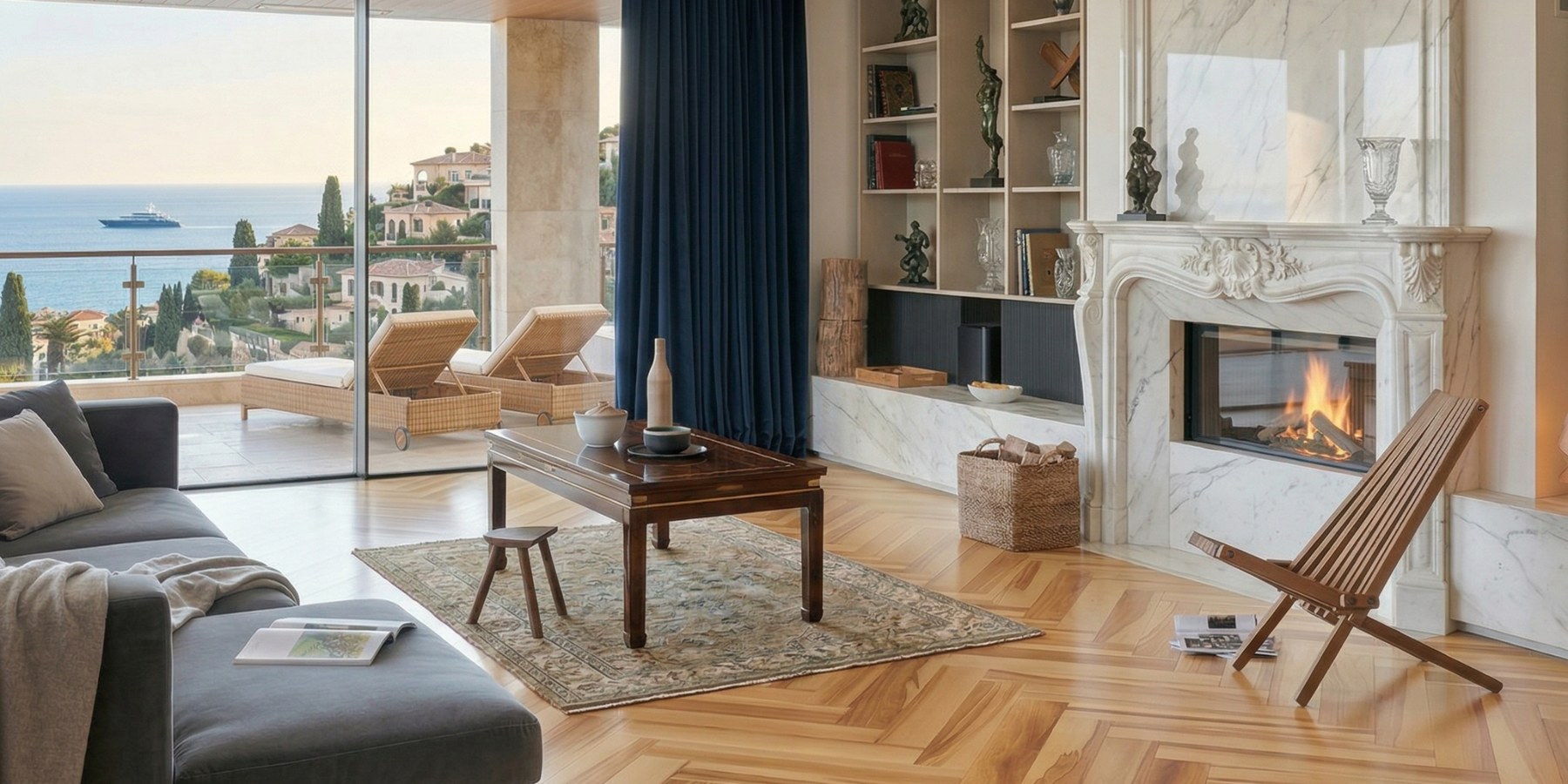
Natural oak is usually the safest starting point when the project still has open decisions around upholstery, wall colour, or joinery. It gives enough warmth to avoid sterility while staying adaptable across Mediterranean, classic, and contemporary schemes.
Deeper tones and contrast
Smoked and deeper wood tones work best when the room already has enough natural light and enough visual space to carry stronger contrast. They can add gravity and elegance, but they also make dust, joints, and transitions more visible if the overall composition is not handled carefully.
Always review samples in real light
A showroom sample is only a first filter. Review chosen tones in the actual room, near the real walls, textiles, and metal finishes that will remain in the final interior.
Need project support?
Request samples, ask for a quotation, or speak with our team about product fit, room use, and specification logic.